What Do Logos of Major Tech Companies Mean?
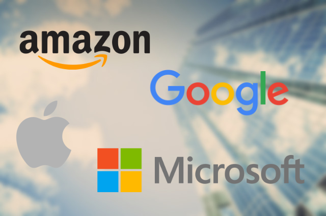
Big companies always give a lot of thought to the design of their logos, but sometimes their significance isn't clear, so if you are curious about the symbolism in the logos of companies like Google or Apple, this post has all the information you want to know. We'll be taking a look at the history of the logos of Amazon, Microsoft, Google, and Apple, as well as any ideas these logos are meant to communicate.
Google has retained its original colored "Google" logo with slight modifications from 1999 to 2013, but the biggest change was in 2015, when Google debuted its updated logo with softer colors on September the 1st, showcasing a new typeface called product sans, created by Google as a simple approachable and geometric style of font for branding purposes. The letter "L" being colored green instead of red, and by that following the primary colors pattern: blue then red then yellow, was according to Ruth Kedar, the logo's designer, a throwback to the idea that Google doesn't follow the rules.
The four squares each represent one of Microsoft's top four services and their primary color: Windows (Blue), Office (Red), Xbox (Green) and Bing (Yellow).
 |
| Top Tech Companies' Logos |
Apple's Logo
Apple's current logo is a flat monochrome variation of its second logo: the rainbow apple with the leaf and the bite, it was designed by Rob Janoff with input from Steve Jobs, the company's founder himself, the bite's role in the logo was to distinguish it from a cherry, and the colors were supposed to communicate the fact that the Apple II, Apple's upcoming computer at the time, can generate graphics in color. In 1999 apple stopped using the rainbow colors as part of their official company logo, but retained the shape, with an aqua theme from 1998 to 2003 and a glass theme from 2007 to 2013.Google's Logo
Although the parent company here is called Alphabet, Google's logo is quite similar to Alphabet's, as they use the same font, also, Google's logo is more recognizable.Google has retained its original colored "Google" logo with slight modifications from 1999 to 2013, but the biggest change was in 2015, when Google debuted its updated logo with softer colors on September the 1st, showcasing a new typeface called product sans, created by Google as a simple approachable and geometric style of font for branding purposes. The letter "L" being colored green instead of red, and by that following the primary colors pattern: blue then red then yellow, was according to Ruth Kedar, the logo's designer, a throwback to the idea that Google doesn't follow the rules.
Microsoft's Logo
Microsoft has had its logo go through many changes before adopting its current logo, all of its previous logos used different fonts to spell "Microsoft" in black text on white space, the current logo is the first to feature colors and an icon next to the company's name, this icon is four flat multi-colored squares in a 2 by 2 arrangement, similar to the tile-based design philosophy of the company, which it uses in all its platforms.The four squares each represent one of Microsoft's top four services and their primary color: Windows (Blue), Office (Red), Xbox (Green) and Bing (Yellow).
Amazon's Logo
It has been a long time since Amazon redesigned its logo, the one it currently uses was a redesign done in the early 2000's, but maybe that's because Amazon still thinks the logo represents the company very accurately. The most significant part of the logo is the yellow arrow from "a" to "z" under "amazon.com", it represents the idea that Amazon offers everything a customer might need, the arrow also looks like a smile, which could signify the great shopping experience that Amazon prides itself on providing.
What Do Logos of Major Tech Companies Mean?
 Reviewed by Yasser Baali
on
2/19/2018
Rating:
 Reviewed by Yasser Baali
on
2/19/2018
Rating:


No comments